
The government is standing by its decision to adopt a controversial image of wattle that bears an unfortunate resemblance to a coronavirus as a new national brand logo.
Trade minister Simon Birmingham has approved a report by the National Brand Advisory Council recommending the image, which Austrade has confirmed cost $10 million to develop.
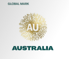
In its recommendation to the minister the council says while the current green and gold kangaroo logo is immediately recognisable, “we considered whether it would shift perceptions of our nation or simply reinforce what people already know about us”.
The council, whose members include mining magnate Andrew ‘Twiggy’ Forrest, Qantas boss Alan Joyce, Australia Post CEO Christine Holgate and Atlassian co-founder Mike Cannon-Brookes, said it preferred the wattle design.
“This small beautiful flower is an optimistic burst of positivity in bright joyous gold,” their report says. “It speaks of warmth, expanding ideas and horizons”.
But while the council saw “pollen-laden stamens radiating warmth, energy and dynamism”, critics took to Twitter to describe it as as “cat-sick”, “scattered raisins” or a coronavirus.
Associative networks

Curtin university branding expert Billy Sung said consumers were likely to link the symbol with coronavirus because of what is known in the business as “associative networks”.
“Consumers operate in an associative network where they process new information according to existing information,” he told radio 6PR this week.
The Coronavirus comparison “goes back to our associative network because given our exposure to virus images day-in and day-out it really does look like the images that are being shown all over the place to symbolise the virus” he said.
The report notes that the design was “market tested” to 16,000 people in China, Indonesia, Japan, South Korea, the US and the UK, and was reviewed by international semiotics experts.
Mr Birmingham on Friday said the new symbol would not replace the Australian Made logo or the Australian Made kangaroo, although it would be used at international trade shows and events.
The wattle logo needed to be viewed in “totality”, said.
“This is not some single logo that we are about to go out and use – it is about a colour palette, a story of how we present Australia, using the wattle imagery in a modern way to bring those different elements together,” he told radio 5AA.
An Austrade spokeswoman said despite the criticism the official launch of the new brand would go ahead as planned later this month.
Leave a Reply