Forget politicians celebrating cranes crowding out the sky or talking up how many new houses are being built — the winner of a hackfest at Australia’s landmark geospatial conference Locate16 has produced what looks to be most vivid and useful picture yet of how hot property development activity is in Australia.
Literally.
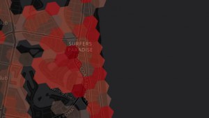
Hugh Saalmans of Insurance Australia (IAG) Limited took out top honours for using Australia’s G-NAF dataset to produce a heat map named CityGrowth that draws on the creation date of every address listed in the national dataset to literally colour in where new addresses are popping up via an interactive webmap.
It’s a tool with fairly obvious applications for the insurance industry, given that new addressesees will have to go to someone for their home and contents insurance, but there’s also no doubting other industries and government agencies (think transport, health and education) will also find it quite useful.
What’s really nice about it though, is that the closer you zoom in on areas of interest, the more granular and detailed the activity in specific locations becomes; and when you zoom out, the colours give activity a broader perspective in the way that (sorry Microsoft) an Excel spreadsheet or bar graphs don’t compare with.
A brief tour of Australian capitals illuminates a few perspectives:
Sydney heatmap
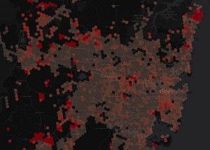
There’s no arguing an already crowded centre is still going up as the city expands on less populated fringes.
And the broad pink hue tells you plenty about redevelopments in the suburbs…
Melbourne heatmap
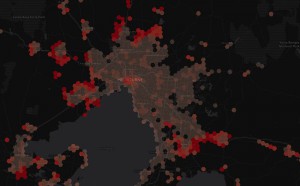
Development pockets also congregating on the fringes…
Brisbane heatmap
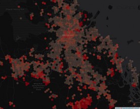
Plenty going on in the middle andf close to the coast.
Geraldton WA heatmap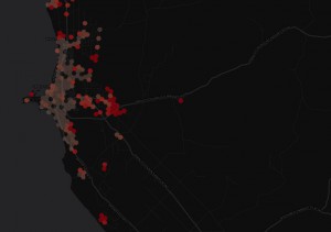
So you tell us what’s happenning here …
With Spatial Source.
Comment below to have your say on this story.
If you have a news story or tip-off, get in touch at editorial@governmentnews.com.au.
Sign up to the Government News newsletter

